Color is one of the most powerful tools in a graphic designer's arsenal. It has the ability to evoke emotions, convey messages, and influence perceptions. Understanding color theory is essential for any designer, as it provides the foundation for making informed choices that can enhance the visual impact of their work.
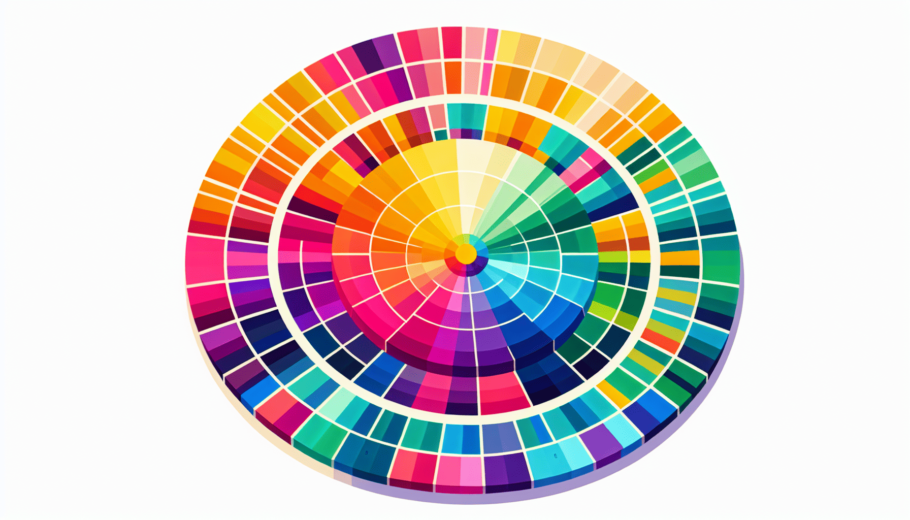
Color theory, in its simplest form, is the study of how colors interact with one another and the effects they produce when combined. It begins with the color wheel, a visual representation that organizes colors around a circle, showing the relationships between primary, secondary, and tertiary colors. This tool allows designers to create harmonious color schemes that can be used effectively in their work.
One of the primary concepts in color theory is the distinction between warm and cool colors. Warm colors, such as red, orange, and yellow, are often associated with energy, passion, and warmth. They can grab attention and are often used in designs meant to evoke excitement or urgency. On the other hand, cool colors like blue, green, and purple tend to have a calming effect, associated with tranquility, reliability, and professionalism. These colors are frequently used in designs that require a soothing or trustworthy tone.
Beyond the basic warm and cool categorizations, color schemes such as complementary, analogous, triadic, and monochromatic also play a critical role in design. Complementary colors, which sit opposite each other on the color wheel, offer high contrast and can make elements stand out. This scheme is effective for creating a dramatic effect and drawing attention to specific parts of a design.
Analogous color schemes use colors that are next to each other on the color wheel. These combinations tend to be harmonious and pleasing to the eye, making them ideal for designs that require a subtle and cohesive appearance. Triadic color schemes involve three colors evenly spaced around the color wheel, providing a vibrant and balanced look. Lastly, monochromatic schemes involve the use of different shades, tints, and tones of a single color, offering a minimalist and sophisticated approach.
Moreover, cultural and psychological factors also influence how colors are perceived. For instance, the color red can signify love and passion in some cultures, while in others, it may be associated with danger or warning. Understanding these nuances is essential for designing for different audiences and markets.
Incorporating color psychology into graphic design involves considering how colors affect mood and behavior. For instance, a brand seeking to establish trust and dependability might opt for blue in its logos and marketing materials. In contrast, a brand aiming to appear fresh and youthful might choose bold, bright colors like orange or lime green.
Ultimately, effective use of color in graphic design requires a delicate balance between creativity and strategy. Designers must be aware of both the aesthetic impact and the subconscious messages that different colors and combinations can convey. By leveraging the principles of color theory, designers can create compelling and emotive visuals that resonate with their intended audience and reinforce the overarching message of their work.
