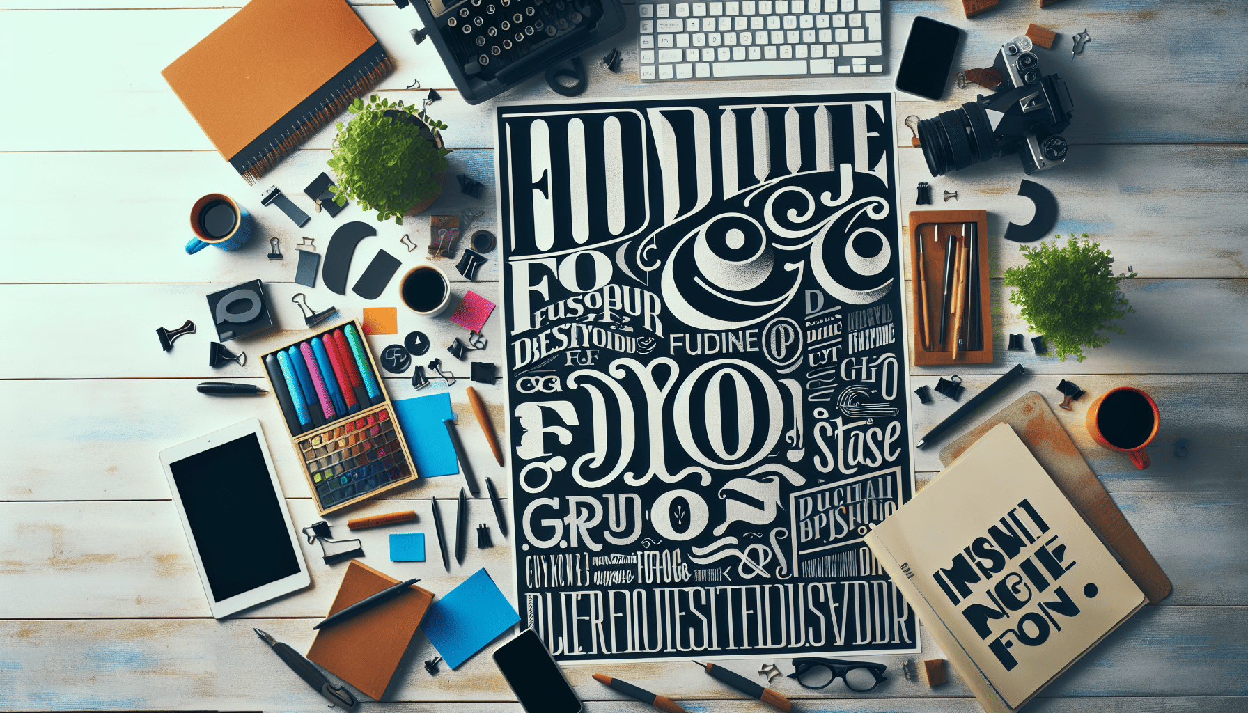
Typography, often considered the backbone of design, is much more than simply choosing an attractive font. It is a powerful tool that can enhance and transform your designs, as well as convey your message with precision and flair. By mastering the nuances of typography, designers can create visually appealing and highly effective communication art. Below are some tips and tricks for leveraging typography to its fullest potential.
Understand the Basics
Before diving into advanced typography techniques, it's crucial to familiarize yourself with the fundamentals. This includes understanding key concepts such as typefaces, fonts, kerning, leading, and hierarchy. Typography is a blend of art and science, and knowing these basics provides the foundation upon which great design can be built.
Choose the Right Fonts
Selecting the right fonts for your project is paramount, as different typefaces convey different emotions and messages. Serif fonts, for example, often evoke a sense of tradition and reliability, making them suitable for formal documents or news websites. Sans-serif fonts, on the other hand, are perceived as modern and clean, fitting for tech brands or creative enterprises. Always consider the audience and the tone of the message when choosing fonts.
Create Hierarchy
Hierarchy in typography involves organizing text so that the most important elements stand out, guiding the reader's eye through the content seamlessly. This can be achieved by varying font sizes, weights, and styles. Typically, the title or headline should have the most visual weight, followed by subheadings and then body text. A clear hierarchy ensures that readers can easily navigate the information presented.
Pay Attention to Spacing
Spacing in typography covers kerning, leading, and tracking. Kerning is the adjustment of space between individual letter pairs, while leading refers to the vertical space between lines of text. Tracking, on the other hand, is the space between groups of letters. Proper spacing ensures readability and adds aesthetic balance to your design. Overly tight or loose spacing can disrupt the visual harmony and make your text difficult to understand.
Limit Font Usage
A common mistake in design is overusing fonts. Sticking to a maximum of two or three font families within a design helps maintain cohesion and avoid visual clutter. When combining fonts, aim for contrast in style or weight to ensure each typeface complements the other, creating an engaging yet unified composition.
Be Mindful of Color
Color adds another layer of expression to typography. It's essential to choose colors that not only reflect the brand identity but also maintain readability. High contrast between text and background increases legibility. Additionally, consider color psychology; colors evoke emotions and responses, allowing you to further tailor your message.
Embrace White Space
White space, sometimes referred to as negative space, is the empty space around text and graphics. It plays a vital role in readability and emphasis, as it prevents a layout from appearing cluttered. Strategic use of white space enhances clarity and can make key messages stand out more effectively.
Experiment with Alignments
Text alignment, whether it’s left-aligned, right-aligned, centered, or justified, impacts the flow and readability of text. Left alignment is the most common and generally the easiest to read. Centered text works well for short lines, such as headlines or quotes, while justified text provides a clean and organized look for dense blocks of text.
Keep Practicing
Mastering typography is an ongoing journey, requiring consistent practice and experimentation. Stay updated with emerging trends, study the work of accomplished designers, and apply what you learn. As you develop a keen eye for detail and an understanding of typography’s impact, your designs will naturally become more compelling and effective.
In conclusion, typography is a vital component of any design project, capable of enhancing not only the aesthetic appeal but also the clarity and impact of a message. By mastering the tips and tricks outlined above, designers can skillfully harness the full power of typography, transforming words into works of art.
